Florique
Florique Honey is a premium brand offering two distinct varieties of honey: Wildflower Honey and Citrus Blossom Honey. The aim of this branding project was to create packaging that not only highlights the natural origins and high quality of the honey but also evokes a sense of elegance and sophistication. The design elements, including an engraved bee illustration, an elegant serif font, and a harmonious color palette, were meticulously chosen to reflect the brand’s essence.
Logo and Typography
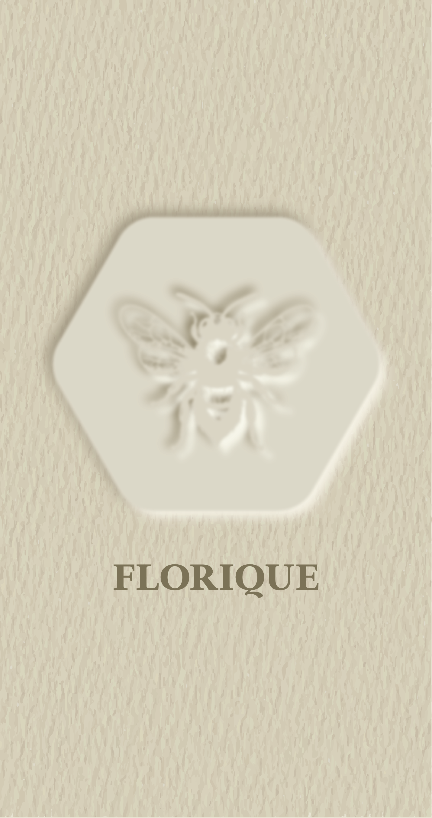
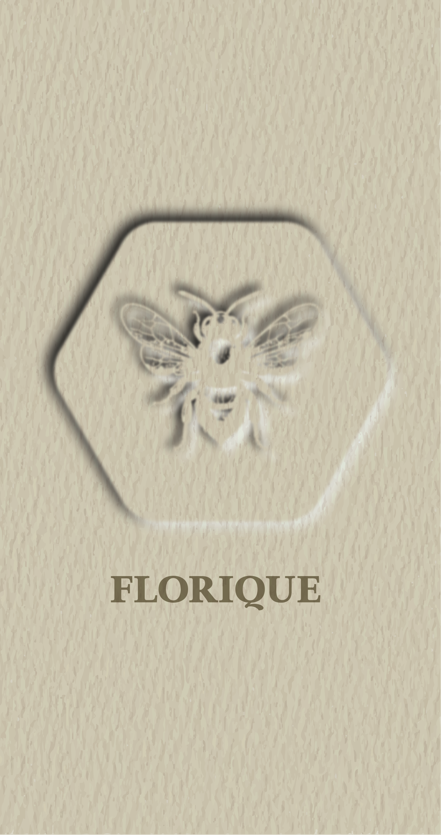
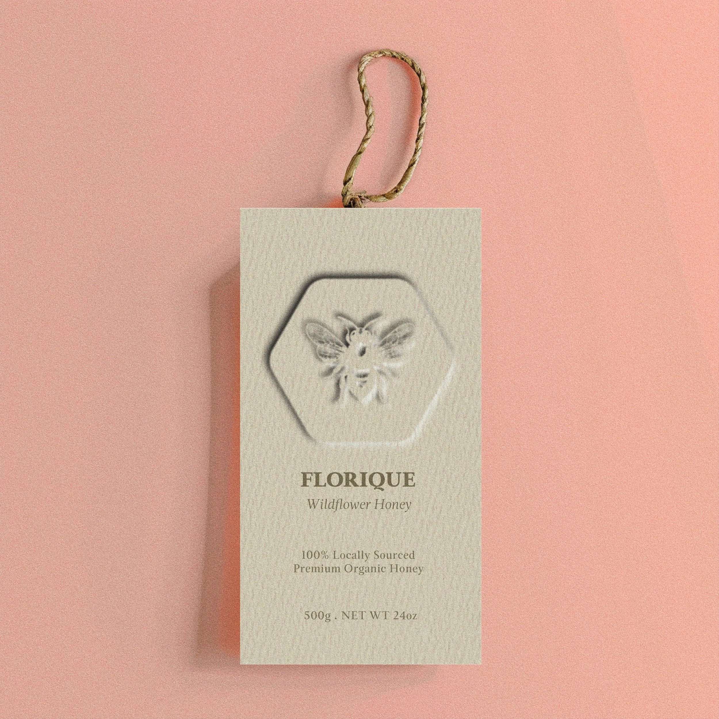
The core of Florique's branding lies in its logo, featuring an intricately engraved bee illustration. This element symbolizes purity, craftsmanship, and the brand’s deep connection to nature. Complementing this, the elegant serif font was selected to convey a timeless and sophisticated appeal. The choice of ivory, white, and brownish tones for the logo ensures it remains visually cohesive with the overall aesthetic, emphasizing a natural and premium feel.
Packaging Design
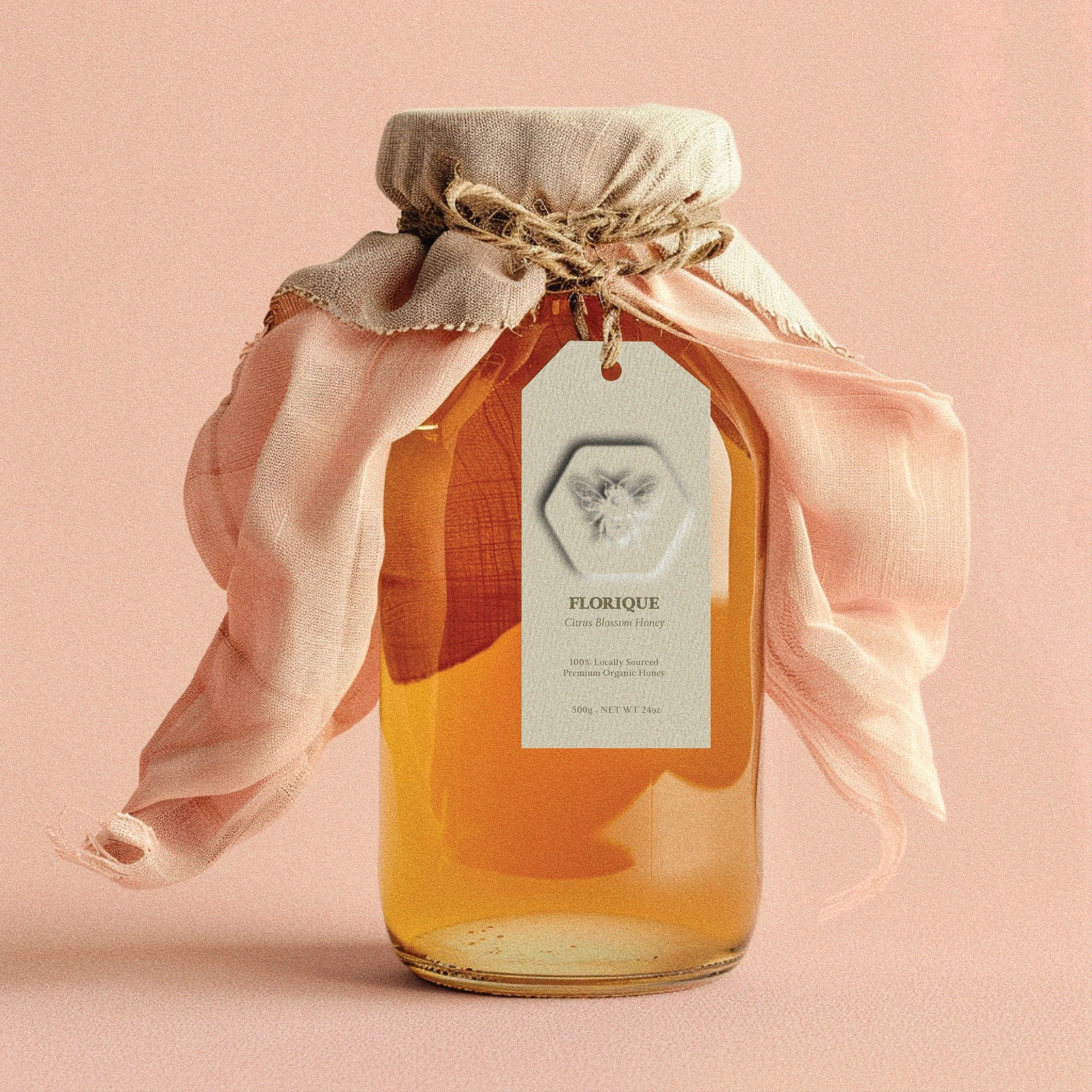
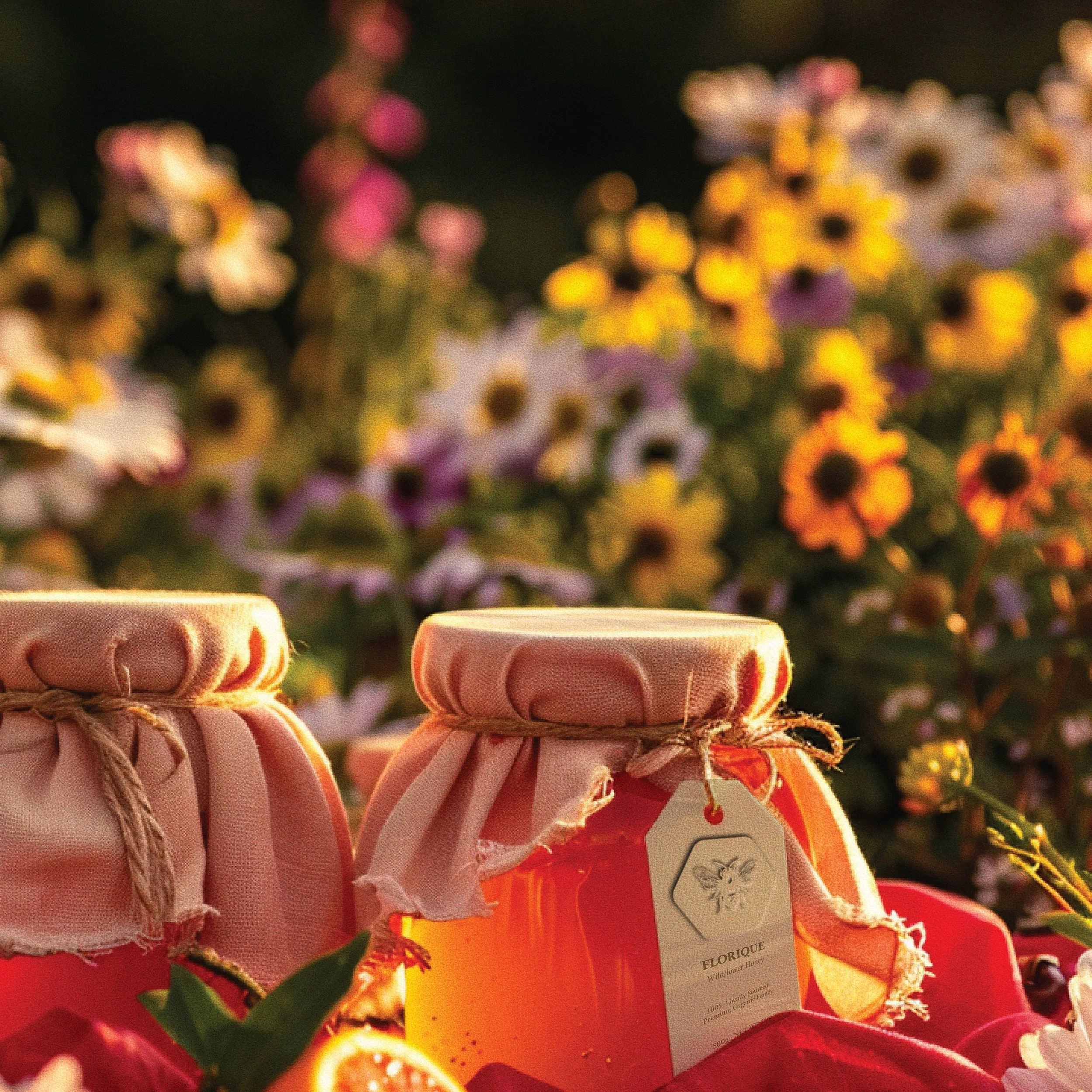
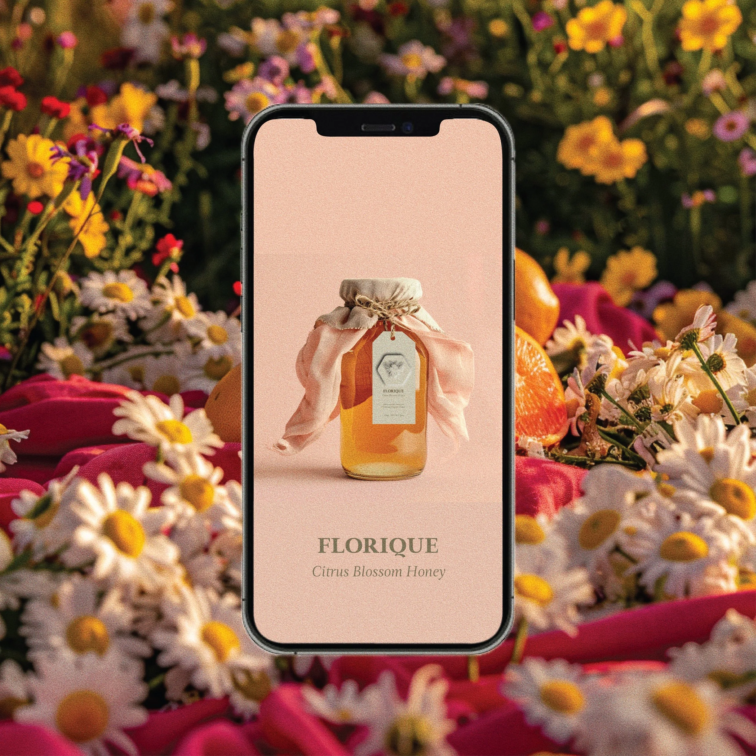
For the honey jars, two designs were created to distinguish between Wildflower Honey and Citrus Blossom Honey. Both jars feature a soft ivory background with the engraved bee prominently displayed. The labels are printed on paper textured material, adding a tactile quality that enhances the natural, rustic yet refined feel of the packaging.
Visual and Textural Elements
The paper texture used in the labels plays a crucial role in reinforcing Florique’s brand identity. It provides a rustic charm without clashing with the overall elegant design. The natural hues of ivory, white, and brownish colors used in the packaging evoke a sense of warmth and authenticity, which is further enhanced by the engraved bee illustration. These elements together create a harmonious and inviting visual experience that speaks to the brand’s commitment to quality and nature.
Conclusion
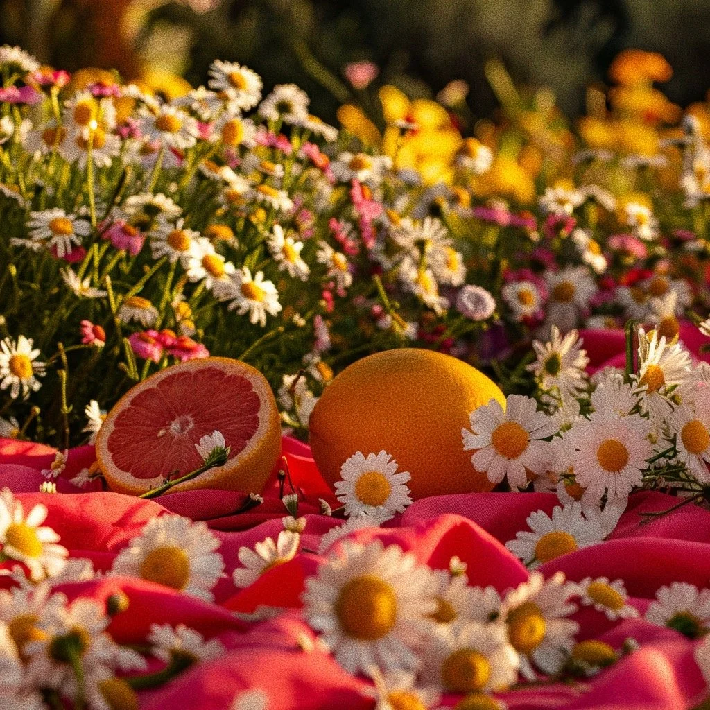
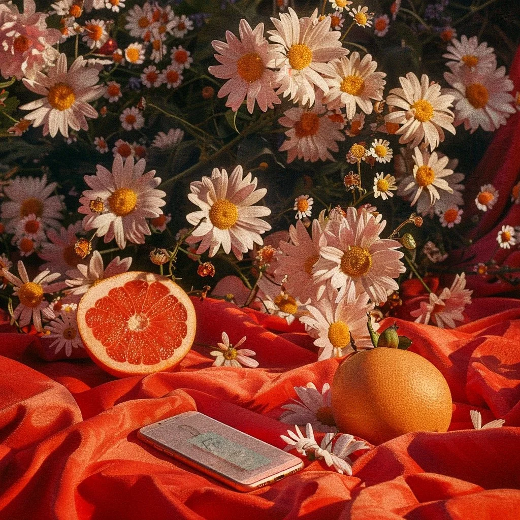
The branding project for Florique Honey successfully combines the beauty of nature with an elegant and sophisticated design approach. The engraved bee illustration, elegant serif font, and carefully chosen color palette create a cohesive and appealing brand identity. This design not only highlights the natural origins of the honey but also positions Florique as a premium brand in the market. The overall result is packaging that is visually stunning, evocative of the fields of flowers and fruits, and reflective of the high quality of Florique Honey.

